Wednesday, 7 March 2012

HUNTED final cut and Final storyboard

http://www.youtube.com/watch?v=HcKElZ9SuOI&context=C3b554d4ADOEgsToPDskJMOmvj1szH_8WaF8AslBbr

For my final cut, I simply made the frames larger and tweeked the sound to get it how I wanted it.


Final Storyboard of HUNTED

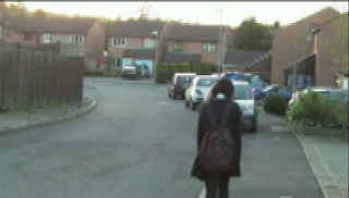
Shot 1.

Establishing wide shot of victim walking down her road on the way back from school.
Atmospheric music introduced (cresendo throughout)


Shot 2.
Low angled long shot of the victiim in her bedroom, drawing. This shows she has power/security in her domestic setting - this suggests she doesn't have it else-where.


Shot 3.

Close up of the victims drawing. Reveals her quiet, introverted character.


Shot 4.

Titles - reveals it's a new film, possibly a breakthrough director. The audience will expect something shocking/gripping as it's a director's first film.


Shot 5.
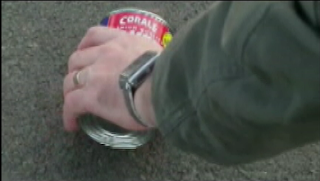
Close up of the stalker's hand as he picks up the last item if her spilled shopping - disembodied arm creates a sense of unease.


Shot 6.
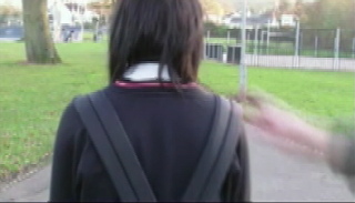
Director's name, links in with previous title.

Shot 7.

Close up of the victim's phone malfunctioning. Distorted foley sound.
Shot 8.

Blackout, music still rising.
 Shot 9.

Mid-shot of the victim jumping as the stalker taps her shoulder. She's ostracised now and feeling vulnerable/jumpy. Quick edit - unsettling
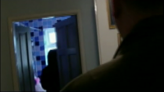
Shot 10.

Two shot of the victim walking into the bathroom as the stalker move into the shot on the right - angle cants (to the right) - she's lost the power/security in her domestic setting. She is now completely vulnerable but she doesn't know yet. Introduce deeper atmospheric music
Shot 11.

Midshot of the stalker running from the house. Sting as the door slams.
Shot 12.

Close up of victim as she spins around, scared. Fast edit
Shot 13.

Close up of the victim being kidnapped on her way back from school. Sting
Shot 14.

Mid-to-long shot of the victim tied up and gagged in the stalkers basement. Low key lighting
Shot 15.

Jolted zoom in to a mid-shot of the victim tied up. Distortion sound
Shot 16.

Jolted zoom again with sting to a close up of the victim as her head swings down, defeated and scared. She's lost all hope of getting set free.

Shot 17.

Close up of the blue prints as the camera zooms in on the custom designed knife.

Shot 18.

Blackout

Shot 19.

Close up of the victims door. Female crying heard.
Shot 20.

Blackout
Shot 21.

The film title. Sting
Shot 22.

Release date. Sting

Wednesday, 15 February 2012

First cut of my teaser trailer: HUNTED

http://www.youtube.com/watch?v=FbVNXnQu3ZE&feature=youtu.be

Here is the first cut of my teaser trailer that I have been working on for the past two weeks. I experimented using atmospheric sound and fades between shots.

Feedback:

These are the results from a peer assessment of my work.

Construction main task
Minimal
Basic
Proficient
Excellent
Holding shot steady


IIII = 4 votes
III = 3 votes
Framing a shot


IIIII = 5 votes
II = 2 votes
Appropriate material

II  = 2 votes
II = 2 votes
III = 3 votes
Selecting mise en scene

II = 2 votes
IIII = 4 votes
I = 1 vote
Editing for meaning

I = 1 vote
IIII = 4 votes
II = 2 votes
Varied shot transitions, caption and other FX

II = 2 votes
IIIII = 5 votes

Use of sound with images/editing

III = 3 votes
III = 3 votes
 I = 1 vote
Overall


IIIIII = 6 votes
I = 1 vote


What people said:
  • Maybe finish on the chair shot
  • Include some foley sounds
  • The sting at the end is really effective
  • Atmospheric sound is really good
  • Use more stings
  • Knife image/poster - need some sort of sound to enhance meaning
  • Add in a scream
  • Experiment with fonts
  • Close up when she is tied up (jolted zoom)
  • Slow down the canted shot - it's a really good shot (maybe a freezeframe)
  • Have more of a sound build up at the beginning
  • Framing and the camera work are brilliant
  • Make the font smaller
From this, I have been editing my teaser trailer and making improvements from this feedback.

Wednesday, 1 February 2012

Female directors

It's a well known fact that the film industry is dominated by male directors, as last year only 5% of the most successful films were directed by women. However, female directors are renowned for sharing a different perspective on the world than male directors. Female directors often direct films containing a heroin, but their films can be just as gritty as The Lovely Bones or Inception (both directed by men).


Catherine Hardwicke:

Catherine Hardwicke Picture
Most recently, she directed Red Riding Hood (2011), starring Amanda Seyfried and Gary Oldman, and Twilight in 2008; but the most interesting of her films, in my opinion, is Thirteen (2003). It's a story about a thirteen-year-old girl's relationship with her mother that is put to the test as she discovers drugs, sex, and petty crime in the company of her cool but troubled best friend. It shows how the wrong choices, made through peer pressure, ruin your life, or leave you with nothing. It's an insight into the pressures of growing up, not even in a worst-case scenario, which is what makes this drama so frightening.


Lone Scherfig:

Lone Scherfig Picture
She is renowned for mastering the art of 'subtle characterisation', which she captures beautifully in An Education (2009). This film shows a talented, intelligent (yet niave) young girl follow her heart rather than her head and ends up heart broken. It's an insight for women not to wear their hearts on their sleeves and to be cautious of what men really want, no matter how flattering they are. Lone Scherfig tells the story in a way that makes us understand Jenny's decisions and feel exactly what Jenny feels, so we follow her 'coming-of-age' journey.

Sofia Coppola:

Sofia Coppola Picture

Arguably most famous for directing Lost In Translation (2003) she also directed The Virgin Suicides (1999) which covers a range of sensitive subjects such as; sucide, religion, upbringing and virginity. It's a dark comedy with hints of drama that 'explores the emotional underpinnings of a family starting to come apart at the seams'. She sheds a unique insight into sisterly bonds, family life and also teenage heartache.

I picked these directors and these films because they are similar to my project. They cover sensitive subjects, like my project, and also they involve teenage girls. As a first time female director, this was interesting research to do because of a women's view on film, and what should be emphasised within a film, and how that differs from male views.

Sunday, 29 January 2012

Improved Film Magazine


In this mock up, I have editing the magazine and the film masthead but putting a black one in the background to give it a 3D effect. I have also put in a pug which advertises my poster. I have also edited the bottom coverlines to look more professional.
I decided to darken the background as a white background looked too bland.
I have also put in a barcode.

Thursday, 26 January 2012

Improved Film Poster


In my improvements, I changed the background by making it more opaque and also by lessening the brightness. I then took out the '...' in the tagline and changed the colour of the masthead. When inserting this into a new layer, I kept the black masthead underneath, which has given it a 3D edgey effect, so I decided to keep this in.
I tried to give the background an orange/red  filter but it didn't look very good, so I decided not to use this.

Monday, 23 January 2012

Feedback for my Ancillary Products 2

Film Magazine:


What people liked:
  • The long shot is good because it shows her isolation
  • The synergy between the knife in HUNTED and the sharp edge on the 'F' in TOTAL FILM
Improvements:
  • It's too bare
  • The background colour needs to change
  • Could the model look at the camera?
  • Feather the image more

Thursday, 19 January 2012

Feedback for my Ancillary Products


Film Poster:


What people liked:
  • The masthead - effective
  • the two shot - really creepy and mysterious
  • the tagline is effective because of the domestic environment of the background
Improvements:
  • background isn't quite right: either black and white or a red/orange filter
  • lose the elipsis in the tagline
  • create a darker tone
  • make the knife in HUNTED red

Sunday, 15 January 2012

Final poster mock up


I chose to use the poster mock up with the transparent background, because I think this was most effective. I made the background slightly darker though, so that it looked more professional.
I chose the tagline 'there are no safe havens' because the stalker has invaded the girls home - which should be a saf haven. This works in synergy with the image of him in her home behind her, as the poster shows his invasion of her 'safe haven'.

Thursday, 12 January 2012

Potential Taglines for my film

TAGLINES for Hunted
·         There is a sinister presence felt everywhere she goes
·         Everywhere she goes the sinister presence follows
·         There are no safe havens
·         You can’t call for help if no-one’s listening
·         It’d never happen to you – would it?
·         The pleasure is in the hunt

Considering my film poster image, I have chosen to have the tagline 'There are no safe havens' because the stalker is in the girl's home, so I thought that this would be the most effective tagline.

Monday, 9 January 2012

Poster mock ups

In my last post, I uploaded a mock up of a film poster for Hunted. However, I hadn't cut the images of the man and the girl out very well, and I'd only really experimented with one effect on the background. I have now made 6 more mock ups, with my characters cut out properly and with the backgrounds completely different.

1. Black and white background:


I don't like this one, because the girl character doesn't really stand out on it. I like how the stalker stands out in the foreground though, because this is the sinister look that I am trying to achieve.

2. Brightness and Contrast background:


This mock up is quite effective because the colours look sharp and surreal, and the situation she is in is quite surreal. However I'm not sure this would be right for the final poster because the background seems too busy.

3. Cyan and saturation change background:


I drained the image of colour because the background was so busy, but I decided to get a less-boring grey/blue hue to it I would experiment with the cyan hue on the background. I do like this image, because I think that the background works well. However, I don't think that the stalker looks quite right.

4. Hue and Saturation change background:


I drained most of the colour out of the background, and I like the effect it has had. Both characters stand out nicely, but I don't think the title looks very good against this background  because the black seems to harsh.

5. Sepia background:


All I did was change the background to sepia on this image. I don't like this one because I don't think that sepia suits the genre of the film and therefore it would send out the wrong message to my potential audience to use this effect on the poster.

6. Semi-transparent background:

I like this one because the two characters stand out really well against the background, but I think I need to blend it in more, but making the background a little less transparent.


Thursday, 5 January 2012

Ancillary research: Film Poster Mock up


I decided that the background was too busy before, and that I would need to change it. In this mock up I have cut out
both of the characters and changed the colour saturation of the background. This is a rough version
of what I could potentially do as my final poster. 


Tuesday, 3 January 2012

Potential images for the magazine


Long shot of Fran walking down her road to her house.
Body language, visibly dejected. no eye contact however,
so therefore it may not be good.
Mid-long shot of Fran tied to a chair in the Stalker's basement.
Physically tied up, face down, scared. Again no eye contact, but
you can see her face, so it may be good.
Two shot of Fran and the stalker.
It's sinister, as is the subject matter of the film.
No eye contact however, so it may not be a very good image for the film.